this was my first attempt at putting together the bones of a magazine cover, i used this as more a chance to look at the structure of the magazine cover i would like to make, i found this hard as even though there are a lot of film magazines, I'm not sure how to stick to the genre of a horror film, whilst sticking to the conventions of a magazine cover, but this is just my first draft so i will keep researching and looking in to film magazine covers further.
I think i would place the masthead right at the top of the cover going right across, so it fitted magazine conventions, making it look like a magazine and not just another poster. Another thing that i think will make it look more like a magazine cover and not just a poster, is the use of left hand thirds and puffs, though i don't want to distract from the main image and title, i still want to give a lot of text information on the front cover, due to the nature of magazines being filled with more than just one article, this is only a draft so i am not sure how the text would fit round the image, but i would make sure it integrated well. To keep with the genre of horror/thriller i think the picture would be more of a close up of a torch lit face or a full length shot of a girl in the woods, but i have being looking at front covers and they don't really use full length pictures and just stick to close ups or mid-shots, i will have to think about this when i and my group go on our first photo shoot. Either way the picture would be dark round the edges of the image, so text could fit well round it in white colours, whilst not taking away from the main image.
This is my first attempt at a poster, i put this together to get a clear understanding of the structure for the poster i want. Hopefully because i have planned this out my next attempt will be close to how i want it. Though this looks very simple, i have seen what may work well, meaning the picture placement to get the most impact or where to put the film title, this has helped me understand the basics and i will hopefully be able to put together a well structured and interesting second draft, hopefully my group will have also had a meeting then to finalize storyboards and film title, so i can get an even clearer image of what to put in.
I have placed the Billing block and the stars names in the place you usually find them on a poster, as they are the two things on the poster that aren't really going to attract attention when i have finished the promotional pack, as the actors we may use in our trailer won't be famous, this means i am concentrating on having a really outstanding image, something that will either catch the eye and interest someone in to seeing it, or one that will get stuck in peoples heads for it's sheer scariness, as we are dong horror/thriller i want it to fit the genre really well, so people understand as soon as they see it, but at the same time i don't want them to just think it's a boring old horror film, so that's why we have also been looking at the Thriller genre, as it adds more to a film and makes it not just scary but interesting for the audience to watch, which is something i have to put across when making my this poster. I was struggling on where to put the release date, as some film posters don't include it and i also don't think it is the most important thing, so i don't want it obstructing the image on the poster, so this may take a while to figure out, after a few more drafts to see what looks best. The release date is important, but only after you have caught the attention with either a really striking image, or a famous face or name on the poster, so i just have to judge the balance.
Each member of the group has decided to make there own storyboard and then we will take a meeting where we all evaluate each others, this means we can combine our best ideas to get a better results and also work on ideas as a team. We are all going off the same story line that we came up with in the first meeting and so most of our ideas will roughly be similar, apart from we will have different views of how to show them, so by doing separate storyboards we can see the best way of communicating the horror/thriller genre within our trailer and get the best out of ourselves.
This is my completed first drafted story board, I've tried to put in as much detail as i possibly can, but i can already tell i need to improve it.
Slide One - This would be the opening shot for the trailer, i like the idea of tricking the audience in to a false sense of security and so by starting the trailer off nice and simple, with a girl just locking her front door to go on a walk, i hope the audience wouldn't suspect anything, which means when the Thriller/Horror suddenly kicks in, it will become even scarier, as the audience weren't expecting it. I think the shot would be best as a close up on her face, establishing who she is and that she must be important and then the camera would look down to the lock to show she is locking the door, or i mid shot that covers both her face and the lock.
Slide Two - In my story board i chose to have a screen of text right after the first shot, as this gets the audience attention quickly, as i have engaged them with a shot of the girl so they want to know more and so i would give them some background information on the director or someone involved in the film, this would interest them further if they liked the directors work or the actor in the film. i also think it helps to break the shots up nicely and it starts the piece off in a nice steady pace, before it becomes much faster, to build tension and so to give people information about the film then wouldn't make sense as it would break up the tension and ruin the pace of the trailer.
Slide Three -
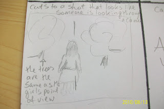
I would then carry on the very normal scene and theme through out, with a wide shot of the girl walking down the road towards a wooded area, the lighting would be very bright and summery, i may put some music over this scene, just a very light piano tune, which the girl would hum. Whilst this is happening I'd over lap the with old images and video, like a memory, The girl walking would be the main image, but I'd put translucent images over the top or I'd make them into short flashes, that would last little more than a second, these images would be of a boy and a girl, no words would be heard, just the two of them being close, like a boyfriend and girlfriend, nothing out of the ordinary. This would further trick and audience. Slide Four - The scene would then cut to the girls point of view shot, where she would be looking up at a summer sky or at least a non grey one, depending on the British weather. The girls point of view shot would pan down to reveal a wood, still being the girls point of view, the wood wouldn't be a traditional horror wood, it would just look like a nature trail or something like that. As all of this is going on the girl would happily be heard humming a sweet little tune that a piano could lightly be heard playing in the background, all this would either put and audience at easy, for some who can guess what may happen, build the tension for them.
Slide Five -
The point of view shot, would then be followed by a long shot, which looks exactly the same as the previous shot, except now the girl is fully in the shot, this would be to try and create the effect of someone following her, this is where people who hadn't of already guessed it would start to realise this isn't a happy film about a girl walking in the woods. To really show that the girl is being watched i would hopefully be able to make this shot look like it's being seen through a camera lens, this would really show people that it isn't a film about a girl in the woods and that it's worst than that. The girl would still be humming the same tune, but now it would have started to get eerie sounding and would be helping to build the tension.
Slide Six -
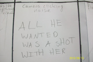
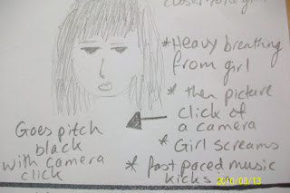
This would be my second screen of text, I'd like to use this as the Tag Line, as i think it fits well with the idea of being stalked and so people take pictures of you and shot is another word for picture, so i think this line works well. This text would be on a black background and the text would be in white, this is a good place to put the text as it's a cut between the nice part of the trailer and the nasty part, as the rest of it gets dark and goes in to the Horror/Thriller genre. This humming from the girl would stop and the sound to take you in to this slide would be a camera click, which again links the whole idea together. The rest of this slide would be silent, which i think would help to build tension, as the audience read this and realise what is about to happen.
Slide Seven - I have described the transition as a flash, like a camera flash , which would tie in with the rest of the trailer. i think with this flash of a frame, which would only be up for a few seconds as i still want to confuse the audience whilst interesting them, with the frame coming up, the girls humming would stoop suddenly and any other music that i may wish to put in, like a plonky piano, or old eerie music like the strangers trailer has. This is the first image you see after the frame of text and i think it works best if it is an object linked with the Horror Genre. As it would only be seen as a flash they wouldn't be able to guess who's it was, without jumping to conclusions which is exactly what i want an audience to do. Also as the trailer will not be in chronological order people wont know what is what and where things happen, but hopefully be giving them a snippet of what is going to happen, by showing them the hand blood covered hand first, this will interest them enough to watch it and find out how it happens.
Slide Eight - This is the the slide where most of the tension starts to build and the audience already know it's a horror film, but with this scene I'd introduce it much clearer and I'd be introducing two of the main characters properly and it would also be a much longer scene than i have put before, as most of the other horror parts of the trailer have been quick and fast paced, but I'd keep this scene on for the longest out of the rest, this would help build tension within the scene.
This part of the scene would probably be the most identifiably in the Horror Genre, as most of the horror and thriller films I have been researching use a element like this, it's a classic set up and can easily scare people, as people do fear the idea of people coming up behind them or being surprised.The way I'd most like to do this scene is by putting a close up shot of the girl in almost complete darkness except for light shining on to the girl so we can clearly see her face, but not much around her and then slowly from the background, over the girls shoulder, you'd see a figure just appearing out of the darkness in a slow creepy way. i also like the idea of her discovering him, not by turning round, but because he takes a picture of her, which of course means we would hear the camera clicking and see a camera, again pointing out the theme of the film.
I have put that i would like the scene to cut to a black screen once you heard the click i think this would work best if the transition was a flash like before with the hand scene, as then it links to the boy taking the photo. Whilst there is a short blackout you'd hear a scream shortly after the camera click and flash to blackout, i haven't figure out how quickly I'd like all to be, when editing I think I'd be able to figure it out better, but i want it to be fairly close and quick paced, so not to loose the momentum of the trailer. Soon after the girl screams i kick in with some face paced dramatic music, which has to be just right, as from the research i carried out music seemed to be a very important part of the trailer, especially for the Horror genre as it can build tension. I'd base the music hear on the tune the girl was humming earlier on, along with the plonky piano bit, this would help tie up the trailer and make the music iconic like most horror films they have a specific music score, which can become from famous like Psycho.
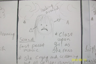
Slide Nine -When the music does kick in i think it should be the start of the scene, with the shots of the girl running through the forest in timing with the music, helping keeping the trailer together and it would also help to build tension. I think shots of her running through the wooded area would look best if they were mid or long shots, as this show she is completely on her own, as you would seen no one else around, further cause tension and panic. I think for some of these shots the camera should move with her, instead of being stationary shots, i think this would help involve the audience more.
Slide Ten -
After a few long shots of the girl running through the woods, it should then cut back to a close up shot of her face, as she slows to a stop in the middle of the forest, you can see that the girl is screaming and crying, but we can't hear it over the top of the music, i think this would be a good effect to have, as then it makes the girl seem completely trapped and i don't want to take away from the music as it keeps the pace. this slide also talks about the girl looking around in panic, I'd have a close up of her looking around and then I'd cut to the next shot, which I'd place as a long shot.
Slide Eleven -
As i said above I'd cut from the close up on the girls face to this, which I'd make a long-shot, so the audience could take in the odd and creepiness of it all at once, as i think close up shots of each bit may look to confusing and at least with this you can clearly see what is happening. I also think with a long shot of the girl surrounded by these big trees that have millions of photos hanging off them, would make the girl look very small adding to the tension that i am trying to build.
As the theme of the film is photographs and being followed, it makes sense to have a shrine of photos just hanging in the woods, this is very creepy and links in with the Horror genre i want. Getting this many photos and hanging them in the forest might be a little difficult, but if we get it right it could really help our trailer alot to convey fear and horror well, so that it doesn't just look like a girl in the woods or any other film.
The long-shot would include an image of the girl turn round and round, gazing at all the pictures, this shot i may also like to look at having a point of view shot just after this scene, with the camera going round in a circle also looking at the photos, just like the girl has, just to put the audience in her shoes and going in a circle would confuse the audience at the same time, but i may just stick to the idea of a long shot of the girl instead.
The lighting i image within this scene would be dark and flickering , like it was lit by candle light, this would add to the shrine effect, also candle light can be very creepy, because you can't see everything as well compared to normal lighting, this may be hard to do, because we still want to enough light to be able to see the girl and to light enough of the photos, but it still needs to look creepy and not give you the full picture, so this will be a lighting challenge. The music within this piece would start to die down from the frantic quick pace piece we had earlier on in the trailer, to a slower quieter drum beat sound, that would beat like a heart, i feel this would add tension to the piece, as the audience would hear the heart beat sound and be able to keep with the pace, heart beat noises are used on game shows to create suspense, something i want to create within the trailer, as you don't know what is going to happen next, the trailer would end on a cliff hanger, this would make people want to see it and find out what happens, if the trailer has done it's job properly.
Slide Twelve -
It would then cut suddenly to this text screen, without any transitions and the music would completely stop, so that the screen would been seen in almost completely silents accept for distant echos of screaming and crying, that you didn't hear earlier on in the trailer when she was running through the woods. i think i sudden end to the trailer would look best as it has built up all this tension and wouldn't look right slowly stopping and as it's under the Horror Genre you want it to be jumpy and sudden , as this is what Horror Genres create. With the sudden stop, it would also help to leave the piece at a cliff hanger, with audiences questioning what may happen next, something that would draw them to watch a full length feature.
- This is only my first draft of a storyboard and this isn't the final idea, me and my team mates will take a meeting where we will look at all of each others work and ideas, so that we can comment on ideas we like and things we don't meaning we will get the best result for our final idea, hopefully meaning we can make a brilliant trailer.
I choose to look at this film as it is a thriller and horror, that all take place for no reason, there isn't any reason for why these people are being attacked, it's just because they were home, the films tag line. For this reason it becomes very real, as this could happen to anyone, this is what makes it so scary, as most horror films they are being attacked for a reason, such as the Saw films, people are usually taken because they need to redeem themselves in some way. But with this film they are just home, the familiarity of home can comfort an audience as you feel safe in your home, so when they become attack it causes the film to become even scarier, as you no longer know where is safe, something i want our trailer to have.
- The poster has a very conventional set up, Billing Block, Tag Line, Actors names and Title, but something different about this film is you can't actually see anyone faces, the victims have there backs to the camera, this means you don't know whether they are alive or how they are.It also means you can give them a face, meaning it could be anyone, it could be you, the exact feeling the film wants to give you. The attackers are looking at the camera, but they have masks on taking away the opportunity to look at them and identify them, you also can't see there emotions, this takes away their human side. all of this put together creates the right effect that the makers of the film want, that it could be anyone. Also you can't see the actors face this means you can't be attracted on first glance by the actors, until you notice the actors names on the back of there bodies. But what may draw someone to look at the poster, is the oddness of three characters wearing these sort of scary masks. - The use of colour on this poster is very simple, not any bright colours, but at the same time i don't feel like there is much of a colour scheme going on. But it feels homily, you can see a wall in the background of the image and most eh colours are matching this wall, this once again tells the audience that it could happen to you, it's in someones home, where someone should feel safe and protected. the only people in real colours or look brighter in the light, are the attackers, this gives them an upper hand, as the bright colours make them standout and you can clearly see them, even if you can't see there face, this gives them more dominance. - The use of text on the poster is simple, even the title doesn't use capitals, this relates to the effect the movie wants to give, these people are complete strangers and aren't important and therefore don't need proper nouns used on them, it isn't there name either, as you never find out the attackers names or what they look like, this helps to add to the tension of it as it could be anyone, it could happen to anyone, this is what Horror films like to do. It also reminds me of the simplicity of the story and how they are just chosenbecause they are home. But the effect used on the title to make the letters slightly stretched upwards, a bit like flames makes them look very haunting and gives them a slight dark edge, but still contains the simplicity of the film and poster.
What i like in this trailer was
It starts happy much like some of the there trailers used in the research, even the music used seems happy go lucky, so the audience don't expect a thing, but when thinking about it, the use of creepy photo projector making creaky noises and the record player, all have connotations of old and useless. These ideas really help added the effect and power the trailer has.
When the music breaks off and starts to jump, then going in to a eerie nothingness, really helps to build tension as it is sudden and the audience understand what is about to happen. the hostile silence of the music when they are in there home tells the audience something isn't right but you can't tell what yet.
I like the way the trailer goes slow fast slow fast. As it slows down just as something scary is about to happen, putting you off guard and helping to emphasis the impact. Something i like.
The use of short shots that are in no real order means an audience can't gage where they are, making them want to find out what happens, in the film as you can't get it from just the trailer.
Once again i choose to look at this genre in further detail, by looking at another Thriller/Horror, that deals with an everyday item, such as a mirror, as i feel this could give our trailer an darker edge and could make our trailer look professional and not a gimmick. This is a very dark film which is reflected in it's posters, even though it is such a simple idea as mirrors are everywhere, but on top of that there are superstitions to do with breaking them and reflections can be scary and creepy.
- As the film is called mirrors and is based on mirrors they have used that look for their posters.The way they have mirrored things such as the text in the poster to coincided with the story works really well, as it also not only links to the story, but creates a very eerie look about it, as you don't know what is the reflection and what is real, much like in the movie. - The mirroring effect also covers the writing used on the poster, giving the poster a very interesting structure, where the Billing Block is cut in half so it not only mirrors horizontally, but also vertically. Also it's not conventional to have a billing block cut in half, but it makes the poster look interesting and it makes you want to look at it, you want to see if both images look the same, along with the text that seems to have been cut in half, to make it follow the mirroring pattern, this means the audience would get more information about the film and who made it. - The colour scheme used on this poster also works very well, as it's all dark blues and blacks making it hard to see, which is the opposite to how mirrors are, but the movie is based on distorted mirrors and so you can see the truth, this also shows an audience the film is going to be dark, as there is no use making it a nice bright poster, when really the film is dark. As usual they have put the title of the film in bright red to standout against the rest of the poster, as that is what they want people to remember the most so that they go to see it. - The image used on this poster is very strong, as it's an action shot of the man walking towards you out of the poster, with his eye line directly at you, unlike some posters where the eyes are off to the side, as if they are looking at something else and you want to know what it is, but with this one he makes the connection, this could be due to the idea of mirrors, as we look directly at ourselves when we look in mirrors, but when you look at the poster to realise you can't actually see his eyes, they are covered by a shadow, this adds further suspense, as you can't make eye contact and the reflective image of the man also has his eyes covered by shadow, but you notice his facial expression is slightly different, which links to the premise of the film. It is also dark, he isn't wearing any bright colours either meaning he is dressed for this photo, something me and my team will have to remember to do, we need to think about what type of costume and impression we want.
- This is the second poster from the promotional package for Mirrors, i decided to look at both of them to get more of an idea of what works and which poster and devices attract attention and ideas best, so have two different posters of the same movie is really helpful.
- The text on this poster is simple like the text on the other poster, as you don't much information off it except what it's called and that Kiefer Sutherland has a star role with int he film. The conventions of the text are regular, with the billing block regular size with the right information within it, there is also some added information at the top of the poster, which could be more important so has to be separate to the rest of the billing block or any other text. The title of the film isn't central like the other poster and because it's in white it doesn't stand out of have the same impact as the rest of the poster or the other poster, but the image is obviously the focal point of this poster instead. The text is interesting though, due to the use of playing with he idea of the movie about being about mirrors, they use that in to title, by having the two R's in the word mirrors reflecting each other, i think this is a really nice touch and would help to also grab peoples attention, while making sure the poster is all nicely linked, with a certain theme through out. They also use the same effect on the other posters, which again makes them feel linked together and makes the promotional pack look a lot more affective in it's presentation.
- When it comes to colour scheme on this poster i don't really see much of one, all the colours on this poster seem very neutral and work well together, nothing stands out, unlike on the other poster where the title was put in a bright red colour, but on this poster it is just put in white, which works well with the back ground and doesn't stand out, unlike the other posters title. This may be because the makers want to attract the most attention to the actors face, which is the most colourful thing in the picture. But with most of the other colours being very neutral and light, the crack effect is used in the image really stands out, helping again to attract the much wanted attention to why there is a crack in the poster and to the fact the film is about mirrors, helping to link everything together.
- Within in the image used we see that they makers have decided to use a crack effect, a device which helps illustrate what the film is about easily, whilst playing on the idea of mirrors to the makers advantage, as it is a very interesting effect and would grab peoples attention easily, as you don't see a crack in a massive movie poster everyday, also cracking a mirror gives you bad luck and so people know it isn't a happy film about mirrors and looking at yourself, it's about the bad things that happen and a much sinister side to them. The use of a close up image on this poster of the star of the film also means, even though it isn't as interesting as the other posters image, it is still very striking if you were walking past it, as most posters are blown up to a massive sizes and so an audience could clearly see who was in the film or just be attracted to seeing it due to how striking the close up is. It also means you can clearly see the crack on the image and that it isn't normal and also the blood upon the actors face, letting an audience understand the genre before seeing it and attracting people to see it.
- With all the links to mirrors that the creators have used to there advantage to gain a interesting and eye catch look, whilst still getting the right information across, tells me that within my posters and magazine covers, there needs to be a recurring theme, such as the camera idea my group discussed, so i could on photoshop effects that would make things look like stereotypical pictures, or put the lines you get when looking through a camera view finder on an image, to make it look like it's being taken, these are just some small things i could do to help make my promotional pack look the best it can and be linked well together, so people understand what it's about.
Things that i felt were important within this trailer, to help build the tension and fit in with the genre of horror were -
The beginning sets a scene of a very normal family household, sunny areil shot, nothing to worry about, setting the audience up with false hope, so when the horror does kick in it's a shock. This happy scene is juxtaposed with the music, which is very minimal, but has connotations of horror.
When the music stops, to build tension at an important part and then suddenly kicks in as action is taking place, i feel really helps to added to the horror and the scare factor, this is something important that i will be looking at when writing the sound track.
Once you realise it in't a happy trailer, the tag line appears to give you a little bit more information, but only a little bit so you want to more. I like how it is broken up through out the trailer, helps to break up scenes, so people have time to understand what they have just seen.
I like the music that kicks in as the trailer gets scary, it has a heart beat sound to it, building tension. What is also good i the way the clips of film keep in time with the heart beat, creating an atmosphere, with these short takes you don't get the full picture and so are scared and unsure of what is happening, making you want to see the film.
From this trailer i see that sound effects and timing really make a trailer, otherwise something that is ment to be scary ends up looking dull.
I decided to look at the promotional pack for One Hour Photo as it is tension filled thriller, that builds much in the way I'd like our own piece to build, it's storyline is also draw form an everyday thing, getting you're photos developed and you never consider who looks at them, so this ordinary thing can become very scary, which is what my group want to do with there idea, we don't want to go all out with monsters and blood, we want to build on peoples on natural fear and if it's linked with and everyday thing it can work very well.
- This posters isn't very interesting a feel and i don't think it would catch any ones eye, unless they were looking for it. But this links in with the storyline, unless you were looking for something dark, you wouldn't see it as it looks so ordinary. Another reason it works is because Robin Williams face can clearly be seen on the poster, he is a very well known star, but usually works with comedies, so this once again would attract an audience, but give them the wrong idea as it's a role you wouldn't expect Robin Williams to be playing. Something that may attract an audience to watch, aside from the photo and billing block, there are also quotes promoting the movie from magazine and well know critics, this may give the poster the edge to make someone want to watch it, as if they see that someone else enjoyed it, they want to know why. the colour schemed used also works well, as most the colours are white of neutral, but then you get the very dark brown photo negatives cutting right across the photo this makes them stand out, as they are the storyline for the film, so it makes sense to highlight them like this, it also draws your eyes to look at Robin Williams face and his eyes, they are giving a very direct look, this gives the poster a slightly darker edge.
From this trailer i learnt -
That the music is a great way to set the mood straight away for what is about to come, even if you don't see what is on screen, just from the music you know something bad is going to happen. This tells me how important it is to get the musics mood just right for the trailer to have the best effect.
The tag line comes in early, revealing early on a bit about the film, i also like have they have a few interlinking tag lines, i wouldn't mind that idea, revealing a little more each time, but still keeping the audience hooked. This is the same with the first shot in the trailer, you know where they are going and what the film involves, but what you don't get is how and what goes wrong, this means the audience is concentrating on the important parts and want to learn more.
All the scenes in this trailer are short takes, or long takes broken up by tag lines and quotes. I think having nothing more than five seconds long is really effective at building tension.
The music is understated and slow building, it isn't in your face, but it helps to build the trailer up in tension. There is alot of dialogue in this trailer which i am unsure if that works, i'd prefer to have little or none.
I chose to look at American Beauty as it is a film that passes it self off as very simple and about a family, when really it goes much deeper and only shows this towards the end, much like how I'd like the story of the trailer we are making to do, lul the audience in to a fake state of security and then reveal, which i feel makes the best reactions for helping to build tension. So i am going to look at how they have made the posters and trailers to fit alongside this idea.
- This poster is very simple, this image is also taken from a scene within the film, something audiences will realise after the film, overall this poster gives off a different impression of the film. but in away that is what the film does until towards the end, you think it's just a messed up family and at the very end the movie starts to show it's true colours, because the poster is simple like this you don't really get what it's going to be about and so it wouldn't really attract an audience on looks of the film, but you may attract them on them wanting to know what it is about and also the actors who are in it. As the film poster is so simple, it ties in well with the films tag line and the whole premise of the film "Look Closer", it's what is underneath all of this, don't take on face value, that some people may when looking at this poster, or the may not get it, but that is what the film is trying to achieve, with everything being revealed at the end. - I like the simplicity of it, sometimes the more simple ideas can come across the scariest or the better, as you don't want to over complicate things for an audience. This poster is also eye catching as it is a nude picture of a woman's belly, something you don't see everyday on posters and on top of that you don't know who's it is and so people wouldn't be attracted to the poster because of a famous face, that means they have to make an impact another way to gain peoples attention and this works well, as it's a very easy simple thing to do. - The lettering used on this poster is also very simple and compliments the arrangement of the poster, it isn't over powering as they use white for the less important information, which matches the skin tone and then of course black for the title of the film to make it stand out and because everything else is in nude or light colours it really stands out, this tells me I'm going to have use a good arrangement and a well thought up colour scheme.
this trailer -
starts off with a really nice setting, nice and sweet, making the audience think it will be a lovely movie, i like htis idea, putting the audience in to a false sense of hope that it will be a nice movie, so that when it changes it will really scare or effect them as they wont be expecting it. But the tag lines separating most shots helps to reveal a little more, to the movie, like a good tag line should, keeping it interesting.
the music at the start is really eerie i feel, which juxtaposes what you are seeing on the screen, another indicator of bad things happening.
The shots at the start a short, so you don't the full picture, usually the short takes start closer to the end, but in this film people are hiding behind there normal life and that is the mysteries.
The music then builds in to almost a romantic soundtrack to a film, fitting with what is going on and revealing that it isn't all bad that there is some love
It quickly changes to long takes meaning we get more information on the movie and what happens, it reveal alot about the movie, which i wouldn't want to do as i'd like to keep more mystery.
The music keeps in time with the shots, something as the sound track writer i'd really like to do, to help build tension within our horror trailer.


 I would then carry on the very normal scene and theme through out, with a wide shot of the girl walking down the road towards a wooded area, the lighting would be very bright and summery, i may put some music over this scene, just a very light piano tune, which the girl would hum. Whilst this is happening I'd over lap the with old images and video, like a memory, The girl walking would be the main image, but I'd put translucent images over the top or I'd make them into short flashes, that would last little more than a second, these images would be of a boy and a girl, no words would be heard, just the two of them being close, like a boyfriend and girlfriend, nothing out of the ordinary. This would further trick and audience.

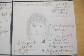 This is the the slide where most of the tension starts to build and the audience already know it's a horror film, but with this scene I'd introduce it much clearer and I'd be introducing two of the main characters properly and it would also be a much longer scene than i have put before, as most of the other horror parts of the trailer have been quick and fast paced, but I'd keep this scene on for the longest out of the rest, this would help build tension within the scene.
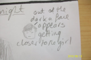

 After a few long shots of the girl running through the woods, it should then cut back to a close up shot of her face, as she slows to a stop in the middle of the forest, you can see that the girl is screaming and crying, but we can't hear it over the top of the music, i think this would be a good effect to have, as then it makes the girl seem completely trapped and i don't want to take away from the music as it keeps the pace. this slide also talks about the girl looking around in panic, I'd have a close up of her looking around and then I'd cut to the next shot, which I'd place as a long shot.
  As i said above I'd cut from the close up on the girls face to this, which I'd make a long-shot, so the audience could take in the odd and creepiness of it all at once, as i think close up shots of each bit may look to confusing and at least with this you can clearly see what is happening. I also think with a long shot of the girl surrounded by these big trees that have millions of photos hanging off them, would make the girl look very small adding to the tension that i am trying to build.
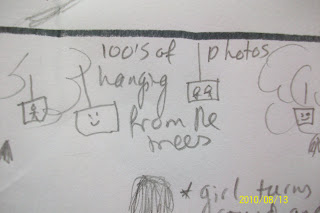


 - This is the second poster from the promotional package for Mirrors, i decided to look at both of them to get more of an idea of what works and which poster and devices attract attention and ideas best, so have two different posters of the same movie is really helpful.
