
Slide One -

This would be the opening shot for the trailer, i like the idea of tricking the audience in to a false sense of security and so by starting the trailer off nice and simple, with a girl just locking her front door to go on a walk, i hope the audience wouldn't suspect anything, which means when the Thriller/Horror suddenly kicks in, it will become even scarier, as the audience weren't expecting it. I think the shot would be best as a close up on her face, establishing who she is and that she must be important and then the camera would look down to the lock to show she is locking the door, or i mid shot that covers both her face and the lock.
Slide Two -
 In my story board i chose to have a screen of text right after the first shot, as this gets the audience attention quickly, as i have engaged them with a shot of the girl so they want to know more and so i would give them some background information on the director or someone involved in the film, this would interest them further if they liked the directors work or the actor in the film. i also think it helps to break the shots up nicely and it starts the piece off in a nice steady pace, before it becomes much faster, to build tension and so to give people information about the film then wouldn't make sense as it would break up the tension and ruin the pace of the trailer.
  I would then carry on the very normal scene and theme through out, with a wide shot of the girl walking down the road towards a wooded area, the lighting would be very bright and summery, i may put some music over this scene, just a very light piano tune, which the girl would hum. Whilst this is happening I'd over lap the with old images and video, like a memory, The girl walking would be the main image, but I'd put translucent images over the top or I'd make them into short flashes, that would last little more than a second, these images would be of a boy and a girl, no words would be heard, just the two of them being close, like a boyfriend and girlfriend, nothing out of the ordinary. This would further trick and audience.
 Slide Four -
 The scene would then cut to the girls point of view shot, where she would be looking up at a summer sky or at least a non grey one, depending on the British weather. The girls point of view shot would pan down to reveal a wood, still being the girls point of view, the wood wouldn't be a traditional horror wood, it would just look like a nature trail or something like that. As all of this is going on the girl would happily be heard humming a sweet little tune that a piano could lightly be heard playing in the background, all this would either put and audience at easy, for some who can guess what may happen, build the tension for them.
Slide Five -
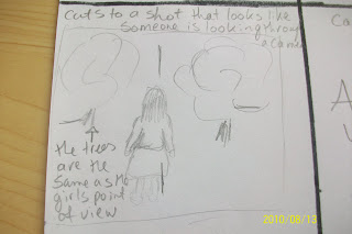
The point of view shot, would then be followed by a long shot, which looks exactly the same as the previous shot, except now the girl is fully in the shot, this would be to try and create the effect of someone following her, this is where people who hadn't of already guessed it would start to realise this isn't a happy film about a girl walking in the woods. To really show that the girl is being watched i would hopefully be able to make this shot look like it's being seen through a camera lens, this would really show people that it isn't a film about a girl in the woods and that it's worst than that. The girl would still be humming the same tune, but now it would have started to get eerie sounding and would be helping to build the tension.
Slide Six -
Slide Seven -
 I have described the transition as a flash, like a camera flash , which would tie in with the rest of the trailer. i think with this flash of a frame, which would only be up for a few seconds as i still want to confuse the audience whilst interesting them, with the frame coming up, the girls humming would stoop suddenly and any other music that i may wish to put in, like a plonky piano, or old eerie music like the strangers trailer has. This is the first image you see after the frame of text and i think it works best if it is an object linked with the Horror Genre. As it would only be seen as a flash they wouldn't be able to guess who's it was, without jumping to conclusions which is exactly what i want an audience to do. Also as the trailer will not be in chronological order people wont know what is what and where things happen, but hopefully be giving them a snippet of what is going to happen, by showing them the hand blood covered hand first, this will interest them enough to watch it and find out how it happens.
 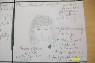 This is the the slide where most of the tension starts to build and the audience already know it's a horror film, but with this scene I'd introduce it much clearer and I'd be introducing two of the main characters properly and it would also be a much longer scene than i have put before, as most of the other horror parts of the trailer have been quick and fast paced, but I'd keep this scene on for the longest out of the rest, this would help build tension within the scene.
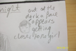
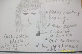
 When the music does kick in i think it should be the start of the scene, with the shots of the girl running through the forest in timing with the music, helping keeping the trailer together and it would also help to build tension. I think shots of her running through the wooded area would look best if they were mid or long shots, as this show she is completely on her own, as you would seen no one else around, further cause tension and panic. I think for some of these shots the camera should move with her, instead of being stationary shots, i think this would help involve the audience more.
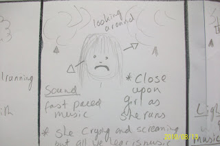 After a few long shots of the girl running through the woods, it should then cut back to a close up shot of her face, as she slows to a stop in the middle of the forest, you can see that the girl is screaming and crying, but we can't hear it over the top of the music, i think this would be a good effect to have, as then it makes the girl seem completely trapped and i don't want to take away from the music as it keeps the pace. this slide also talks about the girl looking around in panic, I'd have a close up of her looking around and then I'd cut to the next shot, which I'd place as a long shot.
 Slide Eleven -
 As i said above I'd cut from the close up on the girls face to this, which I'd make a long-shot, so the audience could take in the odd and creepiness of it all at once, as i think close up shots of each bit may look to confusing and at least with this you can clearly see what is happening. I also think with a long shot of the girl surrounded by these big trees that have millions of photos hanging off them, would make the girl look very small adding to the tension that i am trying to build.
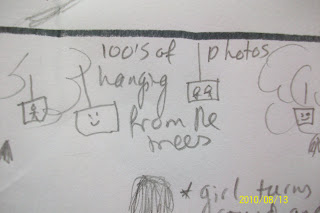


The lighting i image within this scene would be dark and flickering , like it was lit by candle light, this would add to the shrine effect, also candle light can be very creepy, because you can't see everything as well compared to normal lighting, this may be hard to do, because we still want to enough light to be able to see the girl and to light enough of the photos, but it still needs to look creepy and not give you the full picture, so this will be a lighting challenge. The music within this piece would start to die down from the frantic quick pace piece we had earlier on in the trailer, to a slower quieter drum beat sound, that would beat like a heart, i feel this would add tension to the piece, as the audience would hear the heart beat sound and be able to keep with the pace, heart beat noises are used on game shows to create suspense, something i want to create within the trailer, as you don't know what is going to happen next, the trailer would end on a cliff hanger, this would make people want to see it and find out what happens, if the trailer has done it's job properly.
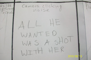
 It would then cut suddenly to this text screen, without any transitions and the music would completely stop, so that the screen would been seen in almost completely silents accept for distant echos of screaming and crying, that you didn't hear earlier on in the trailer when she was running through the woods. i think i sudden end to the trailer would look best as it has built up all this tension and wouldn't look right slowly stopping and as it's under the Horror Genre you want it to be jumpy and sudden , as this is what Horror Genres create. With the sudden stop, it would also help to leave the piece at a cliff hanger, with audiences questioning what may happen next, something that would draw them to watch a full length feature.
- This is only my first draft of a storyboard and this isn't the final idea, me and my team mates will take a meeting where we will look at all of each others work and ideas, so that we can comment on ideas we like and things we don't meaning we will get the best result for our final idea, hopefully meaning we can make a brilliant trailer.
No comments:
Post a Comment