 This poster i feel again fits all the conventions of a horror film poster. i have the starring actors name at the top of the poster, which is a very normal place to put this, i also put it in a clear text like Aerial and in a bright white colour so that it can be clearly read and seen on the poster against the dark background. It's not the most interesting piece of text on the poster, as i wanted the title to grab peoples attention first, but it is clear enough for people to read and see it, which is important as movies can be judged by what actors are involved in them. I also put the actors first name in a bigger sized font to attract peoples attention. I then have the convention of the Tag Line, a key part of a movie poster as it can help interest people by giving a little away about the movie, whilst not telling them everything. this is a tag line i came up with and have been using through out my planning, as our group haven't yet had a meeting to discuss this properly. I used the font chiller on the tag line to give it a creepy effect, reflecting the genre of the movie. I also put it in red, as red has the connotations of blood, linking in with horror so that people defiantly wouldn't think it was a romantic film and to really emphasis this, i used the liquify tool to make it look like it was dripping, but as it was text it still has to be clear to read, so i the text effect bevel and emboss on it to try and help it stand out. I am unsure if this has worked as well as i wanted it to, as the dark background and text are hard to see over each other and it doesn't stand out, so this is something i will have to work on. I really like the title i have been using on the posters, as i feel it looks really interesting, with the smudged dirt look, so will attract an audience and it also has impact due to the font i used (blackoak) and the structure of the title, using the same P for both words has a really interesting effect, which i feel would interest and catch peoples eyes. Some of the things i might look in to changing on my next draft would be the colour, which is yellow and i originally chose it to reflect the flash of the camera and it does stand out against the dark background really well, but it's to neutral and may not reflect the genre of horror well enough, so i may look in to changing it. A big thing i need to fix on my next draft is the pictures, as they don't catch your eye aty all, the biggest problem is the size of them, you can't see the main actress , which is important as this can attract and audeince to see a film depending on who's in it and though i have her name at the top people don't always read the name or know the name of the actors. Also people would stop to look at it, it just looks like a boring dark heart shapped thing, i feel it dosen't add anything to the poster. I also need to edit the images, as they still have date stamps on and just need a little work done to them so that they can catch peoples eye. I also need alot more images for the poster. Then i want to work on the blood drip, to make it look a little more real, so that is something i will have to practice with the tools on photoshop with, i'd also like it to look part of the poster by having it dripping properly, but at the moment the bevel emboss effect i have used makes it stand out to much against teh 2D background, though it does help the poster fit the horror genre, so it's soemthing i want to keep.
Wednesday, 29 September 2010
Draft Four - Poster
After my third drafts of my movie poster, working from ideas i had on paper, i decided to look further in to developing the heart and pictures film poster, though this could be mistaken for a romantic film poster i am going to use conventions and ideas suited for the horror genre, so hopefully if i use them properly the poster will have the impact of a horror film and tell the story slightly with out giving to much away.
This poster i feel again fits all the conventions of a horror film poster. i have the starring actors name at the top of the poster, which is a very normal place to put this, i also put it in a clear text like Aerial and in a bright white colour so that it can be clearly read and seen on the poster against the dark background. It's not the most interesting piece of text on the poster, as i wanted the title to grab peoples attention first, but it is clear enough for people to read and see it, which is important as movies can be judged by what actors are involved in them. I also put the actors first name in a bigger sized font to attract peoples attention. I then have the convention of the Tag Line, a key part of a movie poster as it can help interest people by giving a little away about the movie, whilst not telling them everything. this is a tag line i came up with and have been using through out my planning, as our group haven't yet had a meeting to discuss this properly. I used the font chiller on the tag line to give it a creepy effect, reflecting the genre of the movie. I also put it in red, as red has the connotations of blood, linking in with horror so that people defiantly wouldn't think it was a romantic film and to really emphasis this, i used the liquify tool to make it look like it was dripping, but as it was text it still has to be clear to read, so i the text effect bevel and emboss on it to try and help it stand out. I am unsure if this has worked as well as i wanted it to, as the dark background and text are hard to see over each other and it doesn't stand out, so this is something i will have to work on. I really like the title i have been using on the posters, as i feel it looks really interesting, with the smudged dirt look, so will attract an audience and it also has impact due to the font i used (blackoak) and the structure of the title, using the same P for both words has a really interesting effect, which i feel would interest and catch peoples eyes. Some of the things i might look in to changing on my next draft would be the colour, which is yellow and i originally chose it to reflect the flash of the camera and it does stand out against the dark background really well, but it's to neutral and may not reflect the genre of horror well enough, so i may look in to changing it. A big thing i need to fix on my next draft is the pictures, as they don't catch your eye aty all, the biggest problem is the size of them, you can't see the main actress , which is important as this can attract and audeince to see a film depending on who's in it and though i have her name at the top people don't always read the name or know the name of the actors. Also people would stop to look at it, it just looks like a boring dark heart shapped thing, i feel it dosen't add anything to the poster. I also need to edit the images, as they still have date stamps on and just need a little work done to them so that they can catch peoples eye. I also need alot more images for the poster. Then i want to work on the blood drip, to make it look a little more real, so that is something i will have to practice with the tools on photoshop with, i'd also like it to look part of the poster by having it dripping properly, but at the moment the bevel emboss effect i have used makes it stand out to much against teh 2D background, though it does help the poster fit the horror genre, so it's soemthing i want to keep.
This poster i feel again fits all the conventions of a horror film poster. i have the starring actors name at the top of the poster, which is a very normal place to put this, i also put it in a clear text like Aerial and in a bright white colour so that it can be clearly read and seen on the poster against the dark background. It's not the most interesting piece of text on the poster, as i wanted the title to grab peoples attention first, but it is clear enough for people to read and see it, which is important as movies can be judged by what actors are involved in them. I also put the actors first name in a bigger sized font to attract peoples attention. I then have the convention of the Tag Line, a key part of a movie poster as it can help interest people by giving a little away about the movie, whilst not telling them everything. this is a tag line i came up with and have been using through out my planning, as our group haven't yet had a meeting to discuss this properly. I used the font chiller on the tag line to give it a creepy effect, reflecting the genre of the movie. I also put it in red, as red has the connotations of blood, linking in with horror so that people defiantly wouldn't think it was a romantic film and to really emphasis this, i used the liquify tool to make it look like it was dripping, but as it was text it still has to be clear to read, so i the text effect bevel and emboss on it to try and help it stand out. I am unsure if this has worked as well as i wanted it to, as the dark background and text are hard to see over each other and it doesn't stand out, so this is something i will have to work on. I really like the title i have been using on the posters, as i feel it looks really interesting, with the smudged dirt look, so will attract an audience and it also has impact due to the font i used (blackoak) and the structure of the title, using the same P for both words has a really interesting effect, which i feel would interest and catch peoples eyes. Some of the things i might look in to changing on my next draft would be the colour, which is yellow and i originally chose it to reflect the flash of the camera and it does stand out against the dark background really well, but it's to neutral and may not reflect the genre of horror well enough, so i may look in to changing it. A big thing i need to fix on my next draft is the pictures, as they don't catch your eye aty all, the biggest problem is the size of them, you can't see the main actress , which is important as this can attract and audeince to see a film depending on who's in it and though i have her name at the top people don't always read the name or know the name of the actors. Also people would stop to look at it, it just looks like a boring dark heart shapped thing, i feel it dosen't add anything to the poster. I also need to edit the images, as they still have date stamps on and just need a little work done to them so that they can catch peoples eye. I also need alot more images for the poster. Then i want to work on the blood drip, to make it look a little more real, so that is something i will have to practice with the tools on photoshop with, i'd also like it to look part of the poster by having it dripping properly, but at the moment the bevel emboss effect i have used makes it stand out to much against teh 2D background, though it does help the poster fit the horror genre, so it's soemthing i want to keep.
Draft Four - Magazine Cover
 This was my second attempt at creating a film magazine in photo shop, with this attempt i tried to go with all conventions of normal magazines, whilst keeping it interesting and action packed, so that people would want to buy it. It also needs to show off the genre and feel of the film. Things that i have improved on since the last draft magazine are the image. i have edited Kate's image and added a background image to it also, which i also had to edit. this was so that the magazines images fitted in with the conventions of other film magazines, film magazines usually have some sort of background image behind the foreground image, this is because it makes it look like a snap shot from the film, so that the front cover can easily put across the type of film it is covering and also it looks interesting, as it looks like it is part of the action making people want to buy it and find out more. The background image had to be dark and fit in with the horror genre, so i have used a dark black background to represent the night and a tree in the corner to show the woods, as if it is a still from the film. this image also had to look plain enough so it wouldn't distract from the main image of Kate, so i edited the tree to look blur in the background and slightly ghostly. i also moved Kate's images position, as before i felt it was the wrong size and looked really out of proportion, even though i did like having Kate's head over lap with the Masthead a bit like some magazine do, to make the image really look like it's coming off the page and part of the magazine, but i felt having the right proportions and a good looking image were more important to the magazines final look. I have also worked on the left hand thirds plugs, which are a very important part of a magazine as they put across extra information about what's in the magazine, so they have to be as interesting as everything else so people feel more encouraged to buy it. I felt the last ones i did looked to plain and not as eye catching as they should be, so i added more and worked with different texts and effects in photo shop.
 Exclusive - With the exclusive information, i added a layer so that i could use one of the paint bushes to create the yellow star behind the text, as i felt this would make it stand out more and fit in with the idea of it being an exclusive. The text on top "Exclusive" i put in white to contrast with the background, i chose the font Rockwell as i felt it made it look important and official, then to make it stand out against the background further u added bevel emboss and a drop shadow, so it really caught peoples eyes. "The Oscars winners list" was written on Gothic heavy and i added a red stroke around the background to make sure people also noticed it and it was over powered by it's title. I think this piece of information works well as it does look like an exclusive. The saw sign i created when using the font chiller to type "Saw" and "3D" on two separate layers and then using the liquefying tool, to make them look even more like blood and to make them look really defined and like blood the bevel and emboss tool. I put this information like this, as on posters the movie title looks a bit like this and i felt i wanted to imitate it as it's a well known brand so people would recognise it. But i put the extra information after the saw bit in much more similar text as people had to be able to read it and i didn't want to distract from anything else on the magazine. "Can you take the blood fest in" for this text i used the font Franklin Gothic Demi Cond, as i felt it was clear and readable, to make the text look interesting but not distracting i used the blend mode on the texts effects to lighten the text, i also gave it a drop shadow so it still stood out. With 50 Films i decided to make this look alot more fun, as the magazine isn't all about horror, so to change it a little bit i used the custom shape tool to create the blob to put the text on, so it would look different to everything else and it also highlights it. to make it look more three dimensional, i choose the colours silver and purple and used the satin effect on it, it looks a bit like a sticker, like a puff of added information. with the text i used Rockwell Extra Bold font, with a drop shadow to make it clear, also as i didn't want to whole magazine to look to dark i used a gradient overlay of a rainbow pattern, which really juxtaposes with the rest of the poster, but to stop it from being to over powering i put a black stroke around it.
I also changed the way the film title looks on this magazine, it isn't very drastic, all i have done is change the way the P is used, instead of having two i make the P bigger enough for both of the words, i felt this was more interesting than just having the two words, as it highlights the alliteration, but this might not be our final title, but this is the way i would like to present it, i am also using this way on my film posters so they match and also look a little more interesting. I also had to work on the extra information i gave for the poster as before i felt it lacked a little bit so i for the main bit of extra information "The next cult horror film" i used the font Frankiln Gothic Demi cond, as it is clear to read and not distracting. i choose to put it in red to fit in with a sort of colour scheme that seems to have appeared which is red, yellow and white, so it can stand out against the dark background, so that this extra information stood out against the title and the other information i pit an outer glow around it using the text effects. Then with the other information underneath i used the same font and colour, but made it smaller and put a inner shadow on it, so it juxtaposes against the bright information on top, but still stands out well enough.
Lastly i changed the bottom plug, instead of it being a solid block, i thought it would look good if i used the same sort of brush i have on the text to make it look slightly dirty, the Dry Media 29 brush, i also chose to put it in red to fit in with the theme and i used bevel emboss on it. The text font is Arial, so it's good and clear.
i think this is very close to my final magazine cover, as i am very happy with it, but may tweak it a little more as i don't feel the left hand third is strong enough.
Editted Images 2
I edited some images to use on my front cover, so that they would be more striking and hopefully fit the conventions of film magazine front cover a little better. i used photo shop. to edit all of these images i have used photo shop.
I originally used this image for the film poster, but i didn't like that draft of the poster, so i decided that i could use this on the film magazine, as the draft i have at the moment looks to black and plain, it doesn't fit in with other magazine film covers, as usually they have backgrounds and look like a scene out of the film, not just an image of the actors as they want it to look striking and action filled to interest and audience, whilst telling them a little about the film. So i took the tree or the magazine instead, the problem with this image is it looks to obviously cut out against the black background, this was one of the reasons i didn't like it on the film poster. It wouldn't work on a magazine cover either as it may distract from the image of the actor, as though in real magazine covers you can see the background and looks like it is out of the film, it isn't distracting and is usually a neutral background, without anything striking within it. So to fix all of this i used photo shop, to smooth of the tree on the black background and to make it more neutral, whilst fitting in with the films genre. On this image i used the patch tool, to help fill in any holes in the image and i also used the smudge tool on the side bar, to try and blend in the tree with the black background, the smudging also gave it a spooky eerie, ghostly look, which really helped to fit in with the genre of the film, it also helped to keep it interesting, but not taking away from the rest of the magazine hopefully. Then after smudging the image, some parts still stood out to much and i felt it would look right when i placed the image of the girl on another layer, as they'd both look in focus, which would one not look right at all and two would take away from the main image of the girl, the person we are supposed to be focusing on. So to fix this i used the blur tool, to put the image out of focus, this really helped to keep the image int eresting but not distracting.
I used this image on my third draft of the magazine front cover, i really liked it and felt it worked well within the poster, but i still felt there wasn't something right with it yet, not only was she the wrong size on the magazine cover, but also she didn't look very interesting. With the original image, she looks a bit red in the face, as the lighting when taking the image wasn't very good and we took them outside, when it was very cold, meaning Kate was cold just wearing a summer dress, so they images weren't perfect. So i decided to open the image as Camera Raw, in photo shop, so i could edit the colours, light and shadows with in the image. i turned up the blacks, this was so that it looked a little darker and she didn't look so red, but i also turned up the exposure so it wasn't to dark. i also played around with the colours, turning up the purple tint, so her cardigan looked really vibrant against the rest of the magazine background and would grab peoples attention. Also after doing all this to the image i turned up the clarity, so the it was more defined, as before had the image quality wasn't very good and so certain lines on the image didn't stand out enough, but with the clarity turned up, everything looked much clearer and striking.
I will now use these edited images to try and make the film magazine front cover for the promotional package, that will hopefully fit conventions whilst putting across the message and genre of the film we are making.
Monday, 27 September 2010
Third Draft - Poster
These are my first attempts at making a film poster using photo shop. I have made two, because i was unsure of how my original idea would come out and how long it would take me to make it, so i made a back up, whilst trying to keep in with the conventions of a film poster and the genre of horror. I was also worried that my first idea would look to much like a romantic film poster, which i sought i want it look like, as it is a twisted thriller/horror, about love, but at the same time i need it to be clearly about horror.

 After my first attempt, of a slightly more conventional looking horror movie poster, i decided to go back to my original idea, that i was worried would look to much like a romantic film poster, as it has a heart of pictures, but i want this to reflect a more of a shrine feel to it, which would link in with the genre of horror. This poster has all the conventions of a normal film poster with a Tag line, release date, title, stars names and billing block. i have used the same title style as i did in the thrid draft for the magazine, as i felt that it worked really well, i did like the other posters title, but it didn't give off the right feel towards the genre of the film, with this the brush effects i have used on it, gives it a faded and destroyed look, telling an audience that it isn't going to be a happy film, this helps to link the poster in with the Horror genre, that i was worried it wouldn't fit in with. I also put the tag line in a horror themed font (chiller), as i thought this would really help to emphasis what the tag line means and that it isn't a happy romance with a guy trying to get a girl, instead it is a horror, where a guy stalks a girl, which is what the tag line and it's font reflects. We haven't come up with final tag lines or film names, but i feel they are very important when trying to reflect and link in with the films genre, as they can give a little bit of the film away in a quick catchy way. The images are layered on top of each other in a heart shape, to sort of reflect a shrine feel, like we have in the trailer. I need the images to look like photos, so people can really tell that it is supposed to be a creepy shrine and they also need to fit in with the horror genre, as this will really help to put the poster apart from romantic films with heart shape posters, as the images aren't happy and fun, they are of the girl lost in the woods and scared. I think that feature works well within the poster, but the problem is, you can't clearly see the actresses face well enough, which doesn't fit in with conventions, as an audience need to be able to see who is in the film to become interested and also who they expect to see in the film, so on my next draft i may need to make the central image a little bigger. I then decided to put a smudge of red, using one of the wet media brushes, on top of all the images, o make it look like blood, i felt that this fitted in well, making the shrine look creepy and it helps to link it in with the genre off horror and will hopefully tell an audience that clearly when they look at it. On my next try i would like to make the red look like it's blood dripping, so i am going to have to practice a bit with the brushes next time and maybe use the liquefy tool on photo shop.
Overall i much prefer this try over the first one i did in In Design as i found it to hard to blend layers properly in In Design, also i felt the poster lacked originality and didn't tell the audience what the film was about properly, so i am going to continue to make drafts based on my origanl idea poster of the heart.

This was my first attempt of putting together a film poster in In Design, it doesn't look much like the second draft i made on paper, as i was worried that, that poster looked to much like a romantic genre poster, so i decided to try another set up. This fits the conventions of any other thriller or horror film poster. It is dark, with the central image of Kate our main star, the image is manipulated, to make it look scarier. I then have a dark black background, with a tree, reflecting where the action of the film takes place. I haven't put the layers together very well, as you can see the the cut line of some of the layers, so the poster doesn't look very professional. It dose fit conventions though, as it has a billing block, movie title and stars names at the top, but i have missed off the release date and tag line, two key elements on a film poster, I'd probably put the tag line at the top of the poster near the stars names and release date next to the title.
With the title i was trying out different styles, from the one i used on the magazine front cover, i tried to make it look like it was glowing, but i feel it looks to plain on this poster and would probably go back to the one i have been using on the magazine cover, as i feel that one fits in better. Overall i am not so happy with the poster, as it looks to generic, it looks likes a horror, but it doesn't express the theme of the film, which is pictures and being stalked. so i think i will try to make the poster i had previous planed, i will just try to work on it to make it obviously horror and not romantic, but still reflecting the twist and story line.
With the title i was trying out different styles, from the one i used on the magazine front cover, i tried to make it look like it was glowing, but i feel it looks to plain on this poster and would probably go back to the one i have been using on the magazine cover, as i feel that one fits in better. Overall i am not so happy with the poster, as it looks to generic, it looks likes a horror, but it doesn't express the theme of the film, which is pictures and being stalked. so i think i will try to make the poster i had previous planed, i will just try to work on it to make it obviously horror and not romantic, but still reflecting the twist and story line.
After my first attempt, of a slightly more conventional looking horror movie poster, i decided to go back to my original idea, that i was worried would look to much like a romantic film poster, as it has a heart of pictures, but i want this to reflect a more of a shrine feel to it, which would link in with the genre of horror. This poster has all the conventions of a normal film poster with a Tag line, release date, title, stars names and billing block. i have used the same title style as i did in the thrid draft for the magazine, as i felt that it worked really well, i did like the other posters title, but it didn't give off the right feel towards the genre of the film, with this the brush effects i have used on it, gives it a faded and destroyed look, telling an audience that it isn't going to be a happy film, this helps to link the poster in with the Horror genre, that i was worried it wouldn't fit in with. I also put the tag line in a horror themed font (chiller), as i thought this would really help to emphasis what the tag line means and that it isn't a happy romance with a guy trying to get a girl, instead it is a horror, where a guy stalks a girl, which is what the tag line and it's font reflects. We haven't come up with final tag lines or film names, but i feel they are very important when trying to reflect and link in with the films genre, as they can give a little bit of the film away in a quick catchy way. The images are layered on top of each other in a heart shape, to sort of reflect a shrine feel, like we have in the trailer. I need the images to look like photos, so people can really tell that it is supposed to be a creepy shrine and they also need to fit in with the horror genre, as this will really help to put the poster apart from romantic films with heart shape posters, as the images aren't happy and fun, they are of the girl lost in the woods and scared. I think that feature works well within the poster, but the problem is, you can't clearly see the actresses face well enough, which doesn't fit in with conventions, as an audience need to be able to see who is in the film to become interested and also who they expect to see in the film, so on my next draft i may need to make the central image a little bigger. I then decided to put a smudge of red, using one of the wet media brushes, on top of all the images, o make it look like blood, i felt that this fitted in well, making the shrine look creepy and it helps to link it in with the genre off horror and will hopefully tell an audience that clearly when they look at it. On my next try i would like to make the red look like it's blood dripping, so i am going to have to practice a bit with the brushes next time and maybe use the liquefy tool on photo shop.Overall i much prefer this try over the first one i did in In Design as i found it to hard to blend layers properly in In Design, also i felt the poster lacked originality and didn't tell the audience what the film was about properly, so i am going to continue to make drafts based on my origanl idea poster of the heart.
Third Draft - Magazine Cover

This was my first attempt at putting a magazine front cover together on photoshop, i have looked at several professional magazine front covers for movies of a similar story line of genre and they all have some sort of action, or give off that feel and they aren't just the actors sitting all pretty, looking like nothing to do with the film, all of them represent the films in some way, so i knew that in my front cover i would have to use a slightly action shot, or at least an interesting one that hopefully put across the films genre.
Masthead: every magazine has a masthead and i wanted mine to fit in with the other film magazines, so i came up with the name "The Cut" this was to link in with what people say when filming. I used the Stencil text on this as i felt it had the most impact, especially in red.
Barcode: i am fitting with the convetions of magazines, as i have a barcode, with a date and issue number next to it, this makes the magazine loo like areal magazine.
Left Hand Third: i am unsure on the left hand third, as it looks a bit boring, all the text is the same, i used Ariel and from making magazine front covers last year i know that it doesn't work to keep everything the same text and colour, it's good to have a colour scheme, but this just looks boring, as i haven't presented the information in a very interesting way, so this wouldn't attract any attention, this is what i will work on for my next draft.
Bottom: i like the bottom bit, as it adds extra information in an interesting way, i like how it fits in well with the rest of the magazine cover well, so i think i will keep this with my next draft or edit it a little, but i do like this.
Image and Background: the background seems to black and boring, i know it is supposed to fit in with the genre of horror, but it just doesn't seem or look right only having a black background, as usually film magazines have very excitting looking covers, unlike music magazines that are uaually very plain, so i am going to have to find something to put in the background, to bring it to life. The image isn't very good either, she looks red, the colour seems a little off, so i may have to manipulate the image in photo shop some more to get a better looking image, as i do want to use this shot. As i feel it will fit well on a magazine front cover, i just need to make it look better, by sorting out the colour balance.
Title: I like the text i used for the title (blackoak) and i decided to use yellow for the title, as it really stand out against the dark background and also i am thinking about flashes on cameras, which i thought white would be to much, so i choose yellow, next time i might go for a lighter yellow as this is a little too bright. I then had the idea to use the paint brushes on the dry brush media section on photo shop to make the title look dirty or faded, linking with the irony of the title, as it's a horror and so i feel this effect links in well with the genre. I still need to work a little bit on the title, but i really like this and want to stay with it.
overall it is an ok first attempt on photo shop, but it is still a little weak, so i am going to have to work on it a little, to change the things i don't think work.
Editted Images

With this image i choose to use the exposure tool on photo shop, where i turned down the light within the image, making it very dark and eerie, i then also used the diffused glow to help make sure all the key elements of Kate's face were picked up, such as her eyes and the terror in them, it also makes her face look very white, but her lips red and stand out, this helps to make her look more innocent. This image before hand looked like it was a spotlight on just Kate, but it still had some trees in the background in it, which i didn't want as i just want the image to focused on Kate's face, as i want to use this for the film poster, so it has to be really clear what the audience is supposed to be looking at and they have to be able to clearly see who is in the film, which i think this image fits perfectly for. The only problem with this image is though Kate's face is still clear, the black of the background falls across her face too much, as i didn't have the best lighting when taking these images, even though i have edited it, it still looks to dark on her face, so i may try and re-take this image, in the same pose but with better lighting.
Friday, 10 September 2010
Second Draft - Magazine Cover
 This was my second go at creating a cover for the promotional package. it's based on the mainly on the structure of my first attempt and the storyboard ideas we had put together in are second meeting, but the title may have to change for the movie, even though we have had our second meeting we still have settled on a idea for the title, so for now this is my name idea and also the story board we have just made isn't the final one, so we may cut the shrine like scene out in the end, which is what the image is based on, but these are just a few of my ideas, for how I'd like the front cover to be set out and possibly the type of photo i would like to use.
- I'd name the magazine The Cut, as this ties in well with movies, as they say Cut after scenes and it also could have links with being let in to the gossip, i really like this name and think it works well. I'm not sure about how i presented the Masthead though, i think the The could be smaller as it's not the main part of the Masthead, but i like it on a tilt, i also need you Photo shop to work on presenting Cut in an interesting way, as at the moment it isn't as eye catching.
- I tried to make the main image look as if it was being taken through a camera, so that's why there are lines and a box, but it just looks a bit like a poster image, which most front covers do as it's really just more promotion for the film, but it doesn't look right here, i still like the idea of having it look like it is being taken through a camera, which would link it well to the films idea, but this may all change when we have our meeting.
- Also i don't like how i have placed the text around the image, the headings don't look very professional, as they are all off to a slant, which isn't a good layout choice. Also the lines on the image that are suppose to represent a camera lens, get a bit in the way of the text, my original idea was for the text to rest comfortably on these lines, giving it a sense of order, but this doesn't seemed to have worked, this means i will have to look at better layout ideas and see what i can do on Photo shop.
- Over all this is just my second attempt and i have got some good ideas from this further evaluation, which I will hopefully be able to transfer to my next draft magazine cover, next i will hopefully be using some original images, on photoshop, instead of doing it on paper.
Second Draft - Poster
 This was my second attempt of putting together a poster for my promotional package for the trailer, i think the outcome is very good and after another meeting with my group, i think i could adapt my ideas well, like the title of the film, which is still unclear. Also we haven't made our final sotryboard yet, but i am pretty sure we are going to go with the camera stalking idea that we have had for a while now, as most the sotryboard drafts we have come up with have had this idea.
 - The central image idea, is millions of photos piled on top of each other to create a heart, this not only would link very well with the premise of the trailer, where you see alot of photos hanging up in the woods, along with camera noises, but it can also very easily be turned in to something very creepy, with the central image being the hand you see in the storyboard for the trailer, with this being in the middle it would attract attention as i would make it larger than the rest of the images and as shown in the poster i was thinking about have what looked like blood dripping of the pictures, this effect can be easily done in Photo Shop, i think this would attract the right audience to the horror film, as it doesn't give much away, but at the same time is very well linked with the trailer, so that an audience would get that it's going to have something to do with pictures. It also looks a bit like a shrine, which links in to the Horror genre, as it's a little bit creepy.
- For the overall structure of the poster i have tried to stick to conventions with the Billing Block, Title and stars names (just some random actors names), but i am unsure about where i have placed the release date and Tag line (which is a work in prgress), as i don't feel they stand out strong enough, along with the Title, i feel they just blend in to the background, but this maybe because i haven't added any colour in to my first draft, so when i do this on Photo Shop, i will hopefully be able to change these problems so that they stand out much better and catch peoples eyes, as they are one of the most important parts on the poster, as it lets audiences know what they have to look out for and when.
- Overall i think this second draft is very successful and can easily be adapted for if any changes happen with the story, but at the moment i think this fits the storyboard we have disscussed in our third meeting very well.
Further Story Board and Transcript
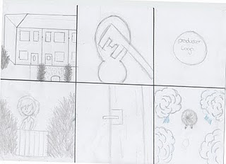
This is the storyboard we came up with as a team in our third meeting, this storyboard combines all of the best ideas we had from our individual storyboards and ideas that we came up with as a team to create the best storyboard we could, that we also felt expressed the genre of horror and thriller, while also showing off the storyline we had come up with in one of our first meetings. We are unsure of the length that of trailer we will have created on the basis of this storyboard, but we can easily edit scenes out or down, so that they can fit in with the time constraints, also a lot of the scenes will be short takes as that will help to fit in with the Genre of horror/thriller and help to build tension with in the trailer, whilst not giving to much away to an audience. We still haven't decided on a name for the film or a tag line, but we all have our own individual ideas.
We would start the trailer with an establishing shot of a row of houses, in a normal suburban street setting
Lighting: it would be a normal day, so daylight, bright and clear, so to juxtapose against what is about to happen. this scene would then cut to a close up shot of a key locking a front house door.
Sounds: there would be birds and cars heard in the background of this scene, re-enforcing the idea that it is a normal suburban street and day.
There would then be a flash (like a camera flash, to fit in with the storyline. everyone in the group had this idea, whilst making their own storyboards and so we decided it would work well in the final storyboard), the flash would take the trailer to a black background, with a production logo or text would appear.
Sound: you would start to hear humming within this scene, it would be coming from the girl, it would be eerie, but still fitting with the sunny houses we have just seen, but over time would hopefully build up tension.
This would then cut to a wide shot of the girl walking through a field and reaching a gate, this would help establishing where she is. there would then be a close up shot of the gate she has gone through closing behind her.
Lighting: it would still be daylight and nice looking
Sound: the humming would continue within this scene. Along with the gate closing, it would sound rusty and creaky, fitting in with the horror style, even though the trailer hasn't yet clearly show that, the sound of it closing would also show that she is trapped.
I think it was Aimee Hill who came up with the idea of having a high angle long shot of the girl walking through the woods, showing a contrast of power, also starting to reveal within the trailer that the girl isn't the one with the power.
Lighting: i think as she is in a woods that the lighting should be a little darker compared to how it was before, reflecting the change in mood.
Sound: the humming would be sound bridged in to this scene also, but i think we wanted to start some light music within the background, either a light piano melody or a light guitar strum fitting in with the humming.
We'd then have a long shot of the girl walking in the woods, but from behind her, building tension as you can't see her face.
Lighting: it would be getting darker, like dusk
Sound: the humming would again continue, with some light music playing over the top along with it.
This would then cut to a long shot of behind the girl, but it would be a point of view shot, from whoever is following the girl, this shot would also be exactly the same as the previous shot, but from the villains point of view and maybe covered by a little more bush to show he is hiding, this would help to involve the audience. to show that it is from the villains point of view i think we'd take the camera off the tripod to make it slightly unsteady, as if he is trying to look at her, we would also add heavy breathing afterward to the shot, to really add tension and show the audience that something isn't right, helping tension. We also thought that as he is supposed to watching her and taking pictures of her that we might be able to add camera viewfinder lines on the shot, but we are unsure if you do that in special effects.
Sound: we'd have heavy breathing, which would suddenly stop, on hearing a click from a camera, the click from the camera would take you in tot he next scene.
The next scene would be of a black background which would have a quote from a magazine about the film on it.
Sound: the humming would fade out and the light music would stop around this scene.
This scene would feature, Kate looking around in the dark slowly and creepily. As if she is about to see who is stalking her
Camera: This would be a close up on Kate's face, so you can get the full impact of the terror as she goes to look around her.
Lighting: the light would be dimming, like evening light. As if the darkness is creeping in on to her and there is no escape.
Sound: After stopping the nice light music, we would bring in a heart beat sound, to help build,d tension and to tell the audience somethings going to happen
There would then be another click and flash to a black background, with some form of text on it, like a tag line or the actors names
Sound: the group thinks it would be good to sound bridge the sound of the heart beat in to the scene to, before the other music kicks in.
After the screen of text, we all liked the idea of having a final blast of quick short takes. so to really help build the tension and panic. As it would be very fast takes, they would have to be of high quality and not to complicated so people could understand what was going on, but at the same timed be left interested and wanting more. These clips would flash together. To also help build the tension and power behind each scene, the group talked about fast paced and energetic music, with loud drums in it, reflecting a heart beat style, with a loud heart beat drum on each scene change, along with electric guitars maybe playing the same sort of tune from before, but faster and more distorted.
Shot 1: the first of thee short takes lasting no longer than five seconds. would be a mid shot of a bloody hand print upon a tree
Shot 2: in the shadows there would be a figures outline, it would be dark around them too, to make them look really menacing.
Shot 3: We'd have a shot that started as an over the shoulder shot, but as the girl runs away, i don't it would be possible to follow her smoothly enough, so we might have to keep the camera stationary while watching her run in to the distance. but i would really like to tree and follow her, but this is up to our camera lady Hannah and if she feels confident to do it well.
Shot 4: this would be a wide shot of the woods falling in to darkness, nothing in it, just the wood looking dark and menacing.
Shot 5: An extreme close up on Kate's face, covered in dirt and blood, but as the shot would be a quick short flash, it would be unclear if it was hers or not.
Shot 6: This would be a low angel shot, maybe taken on the ground of the girls feet as she runs quickly, i think this will disorientate watchers as they have been used to everything being shots of the body in mid or close up shots.
Shot 7: We would have a mid shot of the girl looking around as it is getting darker in the woods, and then the camera would pick u a dark shadow by a tree in the background.
Shot 8: We then wanted a close up of the girl slowly turning her head to see what's behind her, but just as you think you're about to see, it cuts to the next shot building tension and fear like a good horror should.
Shot 9: The music would stop at this point in the trailer, and all we are left with is a drum beat. the shot would be a wide shot and this idea is the same shot i had on my story board for one of the last scenes, as i felt it gave a little bit of a look in to the movie, but still left the watchers wanting more, to see what happens and also it is unclear of where it is in the time line. It is the girl standing in the middle of a shrine of photos all of her. this shot would be a little longer than the others i think to get the hole impact.
Shot 10: there would then be a sudden cut to a black background with the name of the movie and five stars. to end there would be a sound of a click, like a camera.


Meeting Log Three - Story Boards and Draft Images
- This was our third meeting, which we decided to use so that we could discuss everyones story boards, with a view to completing our first joint draft story board, meaning we can start to plan further ahead, with a view to filming our trailer, or at least filming some test shots soon, so we can see what works, whether the trailers long enough or too long, which is what we have mainly been struggling with when it comes to making a storyboard all our own story boards or making our joint draft story board, as we are unsure of how long what we have already come up with is, we know we want a lot of fast cuts, but are unsure about how fast and how many fast cuts we want. We discussed all of this in our third meeting.
- We also looked at each others draft images that we took on the first photo shoot of Kate our chosen main star of the trailer, we looked at what images worked and what didn't, helping us with ideas we may have for other photo shoots, looking at everyone's images together helped us to evaluate and see where each other are at, in terms of where our ideas for magazine and posters are going, we also could see what looked good.
- We read out and explain our own story boards to the group, with everyone taking notes, so that our joint storyboard would be a mixture of everyone's work and so that we could make note of the things we liked the most, in other peoples trailers, making sure they made it in, i think this helped us to build our first joint draft story board well, as everyone has a bit of there own work in it and it is also a mixture of everyone's best ideas, hopefully meaning that every second of our trailer will be interesting and capture the audience whilst watching it. All our story boards centered around the same idea and had some similar scenes within them, as we all had agreed early on about what the story line of our trailer was going to be, but we all had some really good individual ideas of how to build Tension and show Horror within our trailer.
- These are the notes from everyone's storyboards, the notes we made, will help us when making our further story board as we can highlight ideas we think would work best:
- Laura:
Laura's story board started with an establishing shot of a girl leaving the house, with a dog, giving her a reason to be leaving the house, then she said it would flash to a black background with a camera noise clicking, she was unsure of what text to put there and what colour it would be, This would then cut in to a wide shot of a girl walking her dog near the woods. It would once again cut to a black background, with a flash, with the names of the actors written in maybe a red blood like font. She then explained that the next scene would be a close up of a girl in the woods, which would either cut to a new shot or pan across to a shot with a mans outline in the shadows, unable to see his face, showing us that the figure is the bad guy, she explained that this would be the part of the trailer where it started to get scary and fitted the genre of Horror, There would then be another click and flash to a black background on which he release date would be written. After that it would then cut to an extreme wide shot of the woods and a girl running scared, with a black shadow coming closer. to end it all a flash of black.
- Aimee:
Aimee's also started with an establishing shot, this time of a street, with a summery light feel to it. cutting to a wide shot of a girl coming out of a door, saying "bye, just walking the dog", cutting to an extreme wide shot of the girl walking a dog in to the woods, she suggested that on the top of this section there would be humming from the girl. So everything starts off very nice and lovely much like Laura's did and my story board, there is then a click from a camera and a flash to a black background with a film logo from some company associated with the movie. This then cuts back to a mid-shot of her walking her dog again, with a shadow and heavy breathing behind her. Aimee then said that she would cut to a high angel shot almost over the girl as she walks, this would create tension, adding to the idea of the Horror and Thriller genre and also showing the audience that it is a jolly film about walking a dog. After this there would be a camera click alongside of an image of the girl walking her dog, quickly followed by a flash to a black background with the tag line, which Aimee is unsure of at the moment for what to put, but we will probably come up with the name and tag line for the film together as a group. She then spoke about what sort of music would be played over the next scene, of a close up on the girls face, she suggested a heart beat sound effect or heart beat drumming. Once again it would flash to a black back ground with light red text of a film review, something that a lot of trailers seem to have. After this Aimee said she would speed the cuts to scenes, making them short takes, this would build up the tense and pace with in the trailer, as people wouldn't have time to understand what they were seeing, but hopefully due to the quality of the filming and shots, they would be interested to find out what was happening. The first short take in this sequence would be of a extreme wide shot of the girl running through the woods, cutting to a bloody hand in the mud, then to a shot of the girls back, making it look like someones behind her, some more shots of the girl running in and out of the woods, with someone in the woods, to end this sequence a shot from above of a girl lying on the floor, making the audience want to know what has happened to her. Then it cuts to a black background with a release date, on the cut Aimee suggested a sound effect of a Dum noise, like a loud heart beat to really end it well.
- Hannah:
Hannah unlike the others didn't start with an establishing shot, instead she went with a long shot of a girl in the woods, with a dog. But like the rest of us she went with a flash to a black background with a title of the film written on the black screen, she also said that some creepy music will start up around this scene, she then said there would be another flash again with screaming in the background, with a mid shot of a girl, she said there would also be a black shadow, the lighting for this scene she thought it would look best around dusk, just as night started to fall. it would flash again with to a black background with the actors names on the background. After the actors names it would cut to a long of the trees in the dark with a hand in the mood all covered in dirt, it would then flash black again with the release date, ending with a black screen and the music ending.
After telling the group about all our own separate storyboards we started to discuss our joint storyboard, combining ideas from each persons storyboard and coming it with new ideas, that stem from our old drafts.
Draft Pictures
These are some of the photos i took on my first photo shoot with the chosen actress, Kate McCormack, she will be playing the main character in the trailer, which is the young girl. This photo shoot was to see what techniques and photos captured the genre of Horror and Thriller well and what looked the best over all, whilst working with lighting and different camera settings to capture interesting images.
Because Kate is playing the main girl who i have always imagined to be very innocent and young looking, the clothes she is wearing in the photos will hopefully be the costume we use in the trailer, as i feel they reflect the innocent and young nature of the character well, the flowery summer dress with the bright purple cardigan juxtapose against the situation the character finds herself in, being hunted, in the dark forest, this also means the bright colours wont blended in to the background or the darkness that we more than likely will be filming in, to create the eerie feel for the trailer.
for most the lighting i either used my flash torch or the flash on the camera. the flash torch gave the photos a very secluded feeling as you could only see what the flash light was on when i took the photo was taken and everything else around was to dark for the camera to pick up, this gave the feeling of exclusion and was really good at creating a spotlight to pick up the only things you want. The other times i used the cameras built in flash, as it was to dark in the wooded area i choose to take the photos to rely on daylight, but the flash did manage to light the picture well, with out drowning out the photo with to much light, next time the group takes photos, i may start the shoot earlier so we have daylight though and i would bring more flash lights to be able to recreate the spotlight eerie effect i did with one flash torch.
The location was a local entry that is heavily wooded, this was a perfect area to take photos, as people rarely walk down it, but a lot of scraps get dumped down there, so it had the dirty eerie side to it, also there was enough of a clearing in between the trees to take decent photos of Kate without tree branches getting in the way, the down side is you can see the houses in some photos we took and also the area is not big enough to film in, so we will have to go somewhere else for that.
These are just a few attempts of the first photo shoot, these are some of the best or at least ones i would like to try again for a better result on our next photo shoot :

What i like about this photo is the way the light only falls on Kate's face, framing it. the rest of the background is completely thrown in to darkness, this links in well with the Horror genre my group is trying to create with this promotional package. It fits this genre as you don't know what's in the dark, all you can see is Kate, creating mystery. The fact it frames Kate's face means you can focus on her well, you aren't distracted by anything else and you also know who is the star of the film as she is the only person on the poster. This image was lit with a torch, i may want to retake the image just so i can get a better quality of image, but i feel that this is one of my best images and would look really great on a Poster for the movie.

I think his is the most commercial looking of all the photos i managed to take, i feel it may work well on a magazine cover, as has a slight action feel to it, as it looks like she is trying to escape. with a little photo-shop work it could look really good, things i need to work on in photo-shop, is the ground around her as you can see a plastic bin bag, which really looks out of place and just looks dirty, it may also take away from the rest of the image. It's a bit to dark in the background, but it may look good on the front of a magazine cover as this has means there is space on the front cover for text, without it distracting from the image. I think this image will look really great on a front cover, but may need a little work, to make it fit in with the horror genre.

This full length shot might work well for a magazine cover, even though a conventional cover uses mid length shots, i still think it would work well, or i could crop it to mid length. I like the lighting in this photo, it is still dark, keeping the Horror element, but you can clearly see Kate the model and a little bit of the wooded area in the background, but the wood is still dark, keeping it scary looking, whilst informing you where she is. I like the pose in this image, as she looks hesitant, she is looking back over her shoulder, telling the audience that she is unsure, but has the rest of her body facing away as if to walk in to the dark and scary wood. I really like the idea of using this image for the front cover of the magazine for the promotional package as most magazine like to use action looking shots, that have something going on and this does, it has a feel of tension also to it and displays the Horror genre well.

i like this close up of Kate's face, but i think the problem with it is though the bottom half of her face is clearly and well lit, the top half where the eyes are isn't, which means you can't see them clearly enough and so from far away it might not have the right impact, also the eyes would help the audience to connect with the poster, as you would be able to see the emotion and fear properly. it would be a really great shot if the lighting was right, so i may shoot this image again, as i do really like it and think it is really stunning. Also i am unsure if it reflects the genre properly, but this may just be because the lighting is right in this image and i can also manipulate the images in photo-shop to give them a better horror feel.

I feel that this image has a really great impact. The location looks really good in this image and you can clearly see where she is, i also think the tree in the background looks really good and with the rest of the background is in black makes it seem very scary, but it is a very long shot and so doesn't really fit magazine cover conventions, i may be able to use it for a poster, but i am unsure. The quality of the image as well isn't good as it was taken in very dark conditions without the right type of lighting and only a flash, in fact it was the last photo taken on the photo shoot, this means it is very grainy as the camera was struggling in the dark. But i still really like this image as i feel it is very striking, she looks very alone and isolated in the woods, which fits the genre and storyline, but i may have to re-take the image as the quality isn't great and also i am unsure if i would use for the movie poster, but i may play around with it.

This image was taken by mistake, as i was holding the camera and torch and so couldn't keep the camera still when i took the shot, but i really like this image as it looks really eerie. It has an eerie glow about as if she is a ghost, with just the top half of her lit, it looks like she is floating, i would really like to try and use this in either the poster or the magazine cover, but it couldn't be the main image as it's not clear enough and so people wouldn't know what it was for or who the actress was, so i may have to photo-shop in to the background of an image, to add to the Horror genre, but i am unsure of really how to use it, even though i want to.
Thursday, 9 September 2010
First Transcript Draft
Though our trailer doesn't contain any speech, as we felt as a group that dialogue would slow down the pace of the trailer and ruin the tension, we do include sound effects, music, props and locations. So alongside the story boards we have all been creating individually we have been writing up some transcripts, so to make sure our idea is expressed in the clearest way possible and so that we can plan towards what we will need for our trailer so when it comes to filming the trailer we don't miss out important items or don't express the trailers intentions or it's genre (Horror/Thriller properly. Once we have all come up with our individual transcripts and story boards, we will come together to discuss ideas and combine all the best bits from each plan and make the official transcript and storyboard to our trailer, so that we can get the best idea overall for our trailer, but we are all making these story boards and transcripts from the same idea, so they should all roughly be the same, this just means we can look at the best ways of expressing ideas and what works well, so we don't waste time while filming. Also we all have our own jobs to do, so whilst coming up with the story boards and transcripts we should be concentrating on each job we have. For me i have sounds and am looking at the sound effects we will be using, such as screams, heavy breathing and camera clicks. Also during our audience research we found that the soundtrack to the trailer can be the most important part, as it is great for building tension and creating power within a trailer, different music can create a different feeling, so i have looking at where I'd bring the music in and fade it down, also what instruments i would use and the tempo within the music to help build tension.
- Character: A young girl no older than 18. She would have a very innocent look about her, her hair is down and she is wearing a summer dress. She looks happy, nothing out of the ordinary, just a simple happy girl.
- Scene One:
Camera: I would use a close up or mid shot, on a girl closing a door, this shot would capture her entire face clearly, establishing her importance and who the audience need to be looking out for. After the camera has had a shot of her closing the door, it would then cut to a close-up of the key being put in to the door and being locked
Location: This would be on a street, for this shot you would only see the front door of the house she lives, which would be an ordinary suburb house, on a very normal street, with nice gardens.
Lighting: Sunny and bright, to give the impression of it being summery, this would be filmed during the day time, in good weather.
Sound: I don't think we'd have any music at this section, just to show how ordinary it is, it's just a girl going for a walk, you'd hear the normal diagetic sounds of the street, with the girl shutting the door and the key in the lock. I may if it's to quiet at this point have the girl humming a tune, but the tension has not started to build in this scene yet, as we'd want the audience to feel relaxed in to a false sense of security.
Props: A house key, A house door.
- Scene Two: Once the key had locked the door the screen will switch to a black slide, where slowly words will appear in white "From the directors of *****"
Sound: The only sound in this scene would be the humming of the girl from the previous scene, so we would have a sound bridge linking all of the scenes together. I may also start a light instrument playing to go along side the humming in this scene if it is to boring. But i would prefer if the girl was just humming in this section, i may also decided that i ant the humming to start here and not in the scene before hand, but when ever i start the humming it will defiantly be in this scene, just to add tension and build on the eerie feel.
- Scene Three:
Camera: after the black the slide of text we'd see a static long shot of a road, it would be in a very suburban area, the house would look much like the house the young girl had just left. The girl would walk left to right across this shot, as it's a long shot, the camera may be place on the other side of the road, to get a good enough shot of the road and the girl walking down it.
Location: The location would be a suburban road, the houses all looking very similar and obviously on the same road as the house the girl was walking out of before.
Lighting: It would be sunny and bright out, the same type of lighting seen in the first scene.
Sound: You wouldn't hear the road, as that can be too noisy and distracting from what is going on in the shot, instead the sound bridge of the girl humming would play over once again, along with a soft instrument (either guitar or piano) would kick in now, I'd prefer the instrument to come in here softly, than in the scene before, but if the humming is to weak i may put the instrument in earlier.
Special Effect: I'm not sure if this is possible in the time we have been given, but i will have to speak with the editor (Aimee Hill) and the rest of the group about this idea in our next meeting. I'd fade over the top of this scene a half transparent image of a boy and a girl (the girl from the trailer), almost like a memory or a old home video, this would add to the eeriness and to to show that something isn't right. As the image layered over the top wouldn't be very clear i think it would put the audience on edge.
Scene Four:
Camera: This would be a low angel shot directly of the sky, gazing at the clouds, after three seconds of sky gazing, the camera would tilt down to look at the horizon, to a point of view shot, from the girls perspective, it would reveal a wood off in the distance, which the girl would be approaching
Location: It would be a heavily wooded area, bare trees without there leaves, looking very uninviting and dark within even though it's sunny. The woods we find in to shot this in would have to be far from houses or roads, so not to capture any other people in the images, as that would spoil the illusion of isolation.
Lighting: The sky would be bright and blue, but the camera tilts down to look at the woods, it would be darker and unfriendly, showing a clear change in the mood of the trailer.
Sound: The humming would once again sound bridge in to this scene, with the light instrument playing continuing, with the same tune over an over, as it would play over and over, it would build tension and start to add a bit of creepiness to it all.
- Scene Five:
Camera: this scene would cut from a point of view shot, to almost an identical shot, but now the girl would be in front of the camera, in a long shot, like someone was behind, which is what we want the audience to feel like. the camera would stay in the same place it wouldn't move, it would just watch the girl walking from behind.
Location: it is identical from before, the same view the girl had, to really emphasis the idea of someone being behind her.
Lighting: same as before, to carry on the idea someone is watching her.
Sound: You would still be able to hear the girl humming, but further away, so the light instrument playing would sound louder.
Special Effect: I'd like to see if there is away of putting lines on the image, to make it look like someone is looking through a camera view finder, this links in with one of the main ideas of the film, that someone is following her and taking pictures, if this effect is possible it will really show the audience something is wrong and build tension up well.
Scene Six: The transition to this would come with a click of a camera (sound effect) something i would have to work on, with the click the black slide will come up and the white words will appear slowly just like before but saying the tag line "All he wanted was a shot with her" this is a work in progress tag line as i have not spoken to my group about what the trailer will contain and so this is the idea for the tag line i have come up with for now.
Sound: As soon as the camera click went bringing up this slide, the girls humming would stop, so that the audience would read this in complete silence, build and eerie tension after seeing the last scene and that someone is following her.
Scene Seven: The transition to this shot would come with a flash, almost like a camera flash, also this scene wouldn't last long and would only be on the screen for a a few seconds, disorientating the audience, it would reveal a hand covered in blood
Props: hopefully we will use a human hand in this shot, but we will have to get some blood to cover it in, we'd cover it in blood so that you couldn't tell whether it was female or male, confusing the audience and as it would only flash up on the screen for a few seconds they'd want to know what was going on and it wouldn't give away much information.
Sound: In this scene it would have gone completely silent, building tension after the light humming music has stopped, then hopefully when the music does kick in, it'll make the audience jump.
Lighting: it would be dark out, it would still be light, but over cast and gray giving the shot a very dark feeling, especially after the light flash and after the girl walking in the woods on a sunny day, it will show the contrast and change of events.
Scene Eight: The transition to this scene from the sixth scene, would be another camera flash type effect
Camera: this image would be a close up on the girls face, you'd almost not be able to see any background because of how close the camera was up to her face, showing her distress and panic, the shot would stay the same on her face through out the scene. But at the same time you would have to be able to she over a shoulder maybe, for an over the shoulder shot of a face appearing out of the dark, after a few seconds of the girl being in the dark on her own, adding tension and building the fear factor.
Location: This would take place in the woods, although due to lighting and the close up you may not be able to see the woods behind her.
Lighting: Around the girl would be completely dark, or dark enough so that certain shapes wouldn't clear to make out, but there would be a spotlight on the girls face, so you can clearly see her expressions and hopefully enough light, that when the other figure appears out of the complete darkness, it makes the audience jump, as hopefully it will look like he has come out of nowhere and all of a sudden his face appears in the shadow light coming off the spotlight on the girls face. the face would be holding a camera and when it takes a picture there would be a flash of light, once the flash goes, it will go to a black screen
Sound: The sound would still be free form any music and almost completely silent, apart from heavy breathing off the girl, showing her panic, the silence would last for a few seconds while she is on her own, then when you see the face appear out of the darkness, you'd see it hold up a camera and take a picture, so the click of a camera would go, taking the shot to a black screen and then you would hear the girl scream.
Timing: Whilst the girl is on her own, it would take a while for the face to appear out of the dark, helping to build the tension, so that would take over 5 seconds almost, but after the face has appeared, it would take the picture the girl would scream all very quickly speeding up the scene, making the audience panic, as they weren't ready for it to happen so fast after such a slow start.
Scene Nine: Once the last scene has gone to black and the girl has screamed, this scene would suddenly flash up, it would also be a very short take and fast paced scene, as this is where the trailer really builds up towards the end.
Camera: it would be a wide shot of a girl running in and out of the trees in the woods, not much else would happen within the scene in terms of action, as it will be to fast paced to go in to detail.
Location: it would still be in the woods that we have been shooting in for the other parts of the trailer.
Lighting: It would be very overcast and getting dark, but light enough for us to be able to see the girl running clearly, we may have to bring extra lighting for this scene if we did it, as you can't rely on natural light to have the right effect you want.
Sound: As soon as the ninth scene starts suddenly, so would very fast paced dramatic music would kick in, keep in time with the rest of the trailer, this hopefully would tell the audience the urgency it and keep the pace of the trailer going. Within the music i think there would be some heavy electric guitars playing some power chords, with the drums playing a sort of heart beat sound, but fast, reflecting the pace of the trailer and the girls heart beat, hopefully getting the audiences heart beats going, the bass might play the same sort of tune the girl was humming from before, but much more rockery and faster to keep in time with the rest of the music. This is something i will have to look in to further, as the sound and music is my job on the trailer project.
Scene Ten:
Camera: After the girl had ran out of shot in the other scene, it would cut to a shot of her face, which would be a close up, the girl would be crying and shouting out, but you wont be able to hear her, just the fast paced music that would be sound bridged over in to this scene.
Lighting: Would be similar to the previous shot, over cast and gray, giving the shot a dark and unwelcoming feel, the dark would be gradually closing in around the girl though.
Costume/Make up: her summer dress will have become ripped and dirty from the running and her trying to escape, along with her hair being messed up and wind swept. We may also make her make-up run down her face and add some blood on to her face, not to much, just enough to make it look like she's been scratched.
Scene Eleven:
Camera: I think this would be the most ambitious scene to shoot. This would be a fairly wide shot of a woods, with a clearing, the girl would be standing in the center of the shot, so you could hopefully be able to see the length of her body, with the trees and the clearing around the shot.
Location: This would be a big scene within the trailer, the final big shot to really attract an audience, so it would still be in the woods , but in a clearing surrounded by big large trees, the girl would be in the middle of the clearing.
Props: As this is the big last scene in the trailer, i want it to look really spooky, I'd dress the scene with hundreds of photos hanging from tree branches around the clearing, the photos would link in with the idea of pictures and being followed, i would then have lots of candles lighting the scene, to really give it that eerie shrine feel to it all, this would interest the audience and would be the final big thing within the trailer.
Lighting: we couldn't light the scene with just candles, as they haven't got enough power and we need to be able to clearly see the young girls face, so as we would want this shot to be dark, we'd have to bring some artificial light with us so that we can light the scene properly, but still have a dark wood area.
Music: After having the sound bridge of the fast paced powerful music through out most of the trailer it would start to slow and fade here, with just the heart beat of the drum noise staying, reflecting the heart beat of the girl, this i feel would also keep the tension well.
Scene Twelve: The transition to the black screen would once again be like a camera flash, to really emphasis the whole story line behind the film, there would also be a camera click noise and once you here the camera click all other music and sounds will stop. slowly the title of the film, my idea for the title is "Picture Perfect" but we haven't had a proper discussion about the name, but i feel this works well as it ties in with the story line well. this would be the end of the trailer, I'm not sure how long this trailer would be, but i think it works well
Our group will be meeting up soon, to discuss ideas and then we will come up with another story board combining all our ideas and a name for the film hopefully.
Tuesday, 7 September 2010
Meeting Log Two - Progress
- My group decided to take their second meeting after the summer break, so that we could catch up with each other and see where abouts in our planning we had all got. We looked through the progress each of us made in our planing over the summer break, as we have been individually coming up with ideas, that we will start to pool together so to create the best outcome overall. Today's meeting was just about us seeing where each other were at. Even though we aren't all at the same place with are planning, we aren't far off each other, i have finished my first draft of a story board, poster and magazine front cover, which i have also evaluated each of them. We also spoke about the roles we had agreed upon taking on before the summer break, i was placed with sound, an important job that not only means i have to make sure whilst filming there is no noise interference and that we can pick the actors voices clearly, but i am also taking on the role of a soundtrack and sound effects, something i have already been thinking about whilst doing my promotional pack research of other films of the same genre we our doing (Horror/Thriller). We all spoke about what we would be doing to make sure we fulfilled our roles to the most and that we were all happy with the roles we have and the genre of film we have decided upon.
- Now that we are all far ahead in our planning we are looking at getting some original images and starting on filming some more draft trailer parts, so we can get a better feel of what we want within our trailer and so that we can all think about our roles in further. Even though we haven't gone over our ideas together properly in a meeting and come up with a final, final idea of what we want within our trailer, we all have the same storyline and basic outline in our heads, so we have started to look at actors and locations to set our trailer. We want a wooded or secluded area, to have that eerie cut off feel, this will hopefully help us build tension within our trailer adding to the Thriller, but at the same time it has to be dark and scary looking to also helping add to the terror, which fits with our Horror, so it can't be somewhere very open, or where you'd expect to see someone else or a car, like a park, so we may go for a local wooded area, as the trees will help to restrict visibility, fitting the Terror/Horror genre well. With an actress we would be looking at some who looks innocent, we don't want someone tough, as then they would look like they could fight back, but we don't want a wimpy helpless girl, so we have to find that fine balance and we also need the audience to be able to relate to them or at least sympathize for, or picture themselves in the position which would add to the Horror or tension, so they have to be ordinary looking. After thinking for a while on how we'd like the actress to look and some possibilities, i then suggested my sister, she is younger than us, but looks old enough whilst still retaining that innocent look we wanted, it would also mean she was easy to get hold of for any film or pictures we might need for our promotional package, she is also a good actress and so we decided that overall she met all the standards we needed, when it came to acting, the look and accessibility.
- I have been looking over my role with the soundtrack and sound effects during the summer holidays and now that i have a frame of a storyboard i can start thinking in detail what i would like where and how i would like the music to build. After looking at a lot of genre specific promo packs, i have noticed that the music builds and builds, until it is very grand and powerful, or you can go down the side of quiet and tension building music, whilst concentrating more on silent to build up tension and sound effects such as screaming, this is something i will have to think about further when my group has decided on the final story board draft, later on this week.
Subscribe to:
Posts (Atom)