Editted Images 2
I edited some images to use on my front cover, so that they would be more striking and hopefully fit the conventions of film magazine front cover a little better. i used photo shop. to edit all of these images i have used photo shop.
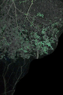
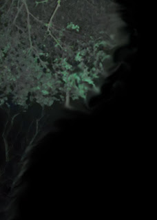
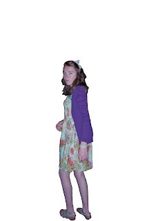
I originally used this image for the film poster, but i didn't like that draft of the poster, so i decided that i could use this on the film magazine, as the draft i have at the moment looks to black and plain, it doesn't fit in with other magazine film covers, as usually they have backgrounds and look like a scene out of the film, not just an image of the actors as they want it to look striking and action filled to interest and audience, whilst telling them a little about the film. So i took the tree or the magazine instead, the problem with this image is it looks to obviously cut out against the black background, this was one of the reasons i didn't like it on the film poster. It wouldn't work on a magazine cover either as it may distract from the image of the actor, as though in real magazine covers you can see the background and looks like it is out of the film, it isn't distracting and is usually a neutral background, without anything striking within it. So to fix all of this i used photo shop, to smooth of the tree on the black background and to make it more neutral, whilst fitting in with the films genre. On this image i used the patch tool, to help fill in any holes in the image and i also used the smudge tool on the side bar, to try and blend in the tree with the black background, the smudging also gave it a spooky eerie, ghostly look, which really helped to fit in with the genre of the film, it also helped to keep it interesting, but not taking away from the rest of the magazine hopefully. Then after smudging the image, some parts still stood out to much and i felt it would look right when i placed the image of the girl on another layer, as they'd both look in focus, which would one not look right at all and two would take away from the main image of the girl, the person we are supposed to be focusing on. So to fix this i used the blur tool, to put the image out of focus, this really helped to keep the image int eresting but not distracting.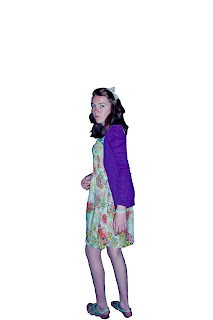


No comments:
Post a Comment