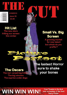
This was my first attempt at putting a magazine front cover together on photoshop, i have looked at several professional magazine front covers for movies of a similar story line of genre and they all have some sort of action, or give off that feel and they aren't just the actors sitting all pretty, looking like nothing to do with the film, all of them represent the films in some way, so i knew that in my front cover i would have to use a slightly action shot, or at least an interesting one that hopefully put across the films genre.
Masthead: every magazine has a masthead and i wanted mine to fit in with the other film magazines, so i came up with the name "The Cut" this was to link in with what people say when filming. I used the Stencil text on this as i felt it had the most impact, especially in red.
Barcode: i am fitting with the convetions of magazines, as i have a barcode, with a date and issue number next to it, this makes the magazine loo like areal magazine.
Left Hand Third: i am unsure on the left hand third, as it looks a bit boring, all the text is the same, i used Ariel and from making magazine front covers last year i know that it doesn't work to keep everything the same text and colour, it's good to have a colour scheme, but this just looks boring, as i haven't presented the information in a very interesting way, so this wouldn't attract any attention, this is what i will work on for my next draft.
Bottom: i like the bottom bit, as it adds extra information in an interesting way, i like how it fits in well with the rest of the magazine cover well, so i think i will keep this with my next draft or edit it a little, but i do like this.
Image and Background: the background seems to black and boring, i know it is supposed to fit in with the genre of horror, but it just doesn't seem or look right only having a black background, as usually film magazines have very excitting looking covers, unlike music magazines that are uaually very plain, so i am going to have to find something to put in the background, to bring it to life. The image isn't very good either, she looks red, the colour seems a little off, so i may have to manipulate the image in photo shop some more to get a better looking image, as i do want to use this shot. As i feel it will fit well on a magazine front cover, i just need to make it look better, by sorting out the colour balance.
Title: I like the text i used for the title (blackoak) and i decided to use yellow for the title, as it really stand out against the dark background and also i am thinking about flashes on cameras, which i thought white would be to much, so i choose yellow, next time i might go for a lighter yellow as this is a little too bright. I then had the idea to use the paint brushes on the dry brush media section on photo shop to make the title look dirty or faded, linking with the irony of the title, as it's a horror and so i feel this effect links in well with the genre. I still need to work a little bit on the title, but i really like this and want to stay with it.
overall it is an ok first attempt on photo shop, but it is still a little weak, so i am going to have to work on it a little, to change the things i don't think work.
No comments:
Post a Comment